Charting
GeoServer can produce maps with charts through the chart extension. Bundled with GeoServer is an open source version of the (deprecated) Google Chart API called Eastwood Charts.
You can display bar or pie charts (Most Google Charts except for Google-o-meter and spider charts are supported by the Eastwood library but the same does not apply to the corresponding GeoServer extension) for each feature on your map. You can control colors or labels. You can use percentages that are in your data attributes or compute percentages from counts on the fly.
How Charting Works
The Charting Extension makes usage of an URL inside the <ExternalGraphic> element of SLD documents. The URL used follows the Google Chart API syntax, but the chart is generated internally in GeoServer, hence no call to external services made removing any privacy or security concern and providing maximum performance. All the information about the chart that you want, such as chart data, size, colors, and labels, are part of the URL.
Inside the URL we can use variable substitution for using the attributes of the underlying features that are read from the datasource allowing us to create stunning dynamic charts using our own data.
An example of a chart created using an <ExternalGraphic> element is shown here below:
<ExternalGraphic> <OnlineResource xlink:href="http://chart?cht=p&chd=t:${100 * MALE / PERSONS},${100 * FEMALE / PERSONS}&chf=bg,s,FFFFFF00" /> <Format>application/chart</Format> </ExternalGraphic>
All URLs start with https://chart? followed by the parameters that specify chart data and appearance. Parameters are name=value pairs, separated by an ampersand character (&), and parameters can be in any order, after the ?.
All charts require at minimum the following parameters:
- cht (chart type)
- chd (data)
- chsv (chart size)
However, there are many more parameters for additional options and you can specify as many additional parameters as the chart supports.
We are now going to see examples and explanation for the various types of charts supported. First of all we will start with the standard features support by all the charts.
Standard Features
All Chart URLs have the following format:
https://chart?cht=<chart_type>&chd=<chart_data>&chs=<chart_size>&...more_parameters...
The standard parameters, as part of the above URL, have the following meaning:
- The cht parameter allows us to control the type of charts; as an example cht=p can be used for a 2D (flat) Pie.
- The chs parameter allows us to control the size of charts; as an example chs=500x200 specifies the chart size (width x height), in pixels. As an alternative we can use the <Size> element of external graphics (we’ll show an example in the following.
- The chd parameter allows us to control the chart data; as an example chd=t:60,40 can be used to provide tabular data to the diagram rendering system. We can use variable substitution and other GeoServer mechanisms to pass data sources value as the chart data. A typical example would be something like chd=t:${100 * MALE / PERSONS},${100 * FEMALE / PERSONS}& where MALE, PERSONS and FEMALE are attribute of GeoServer data sources.
- The chl parameter allows us to control the label of charts; as an example chl=Male|Female can be used to label a chart.
Pie Charts
Quoting Wikipedia,
“A pie chart (or a circle graph) is a circular chart divided into sectors, illustrating numerical proportion. In a pie chart, the arc length of each sector (and consequently its central angle and area), is proportional to the quantity it represents.”
Let us know create a sample map using the Pie Charts element leveraging on the the data provided with the training. Afterwards we will review the various options.
To print dynamic charts on a map using a Pie symbol over the United States map add a new style called statespies by adding the SLD provided below as indicated in this picture.
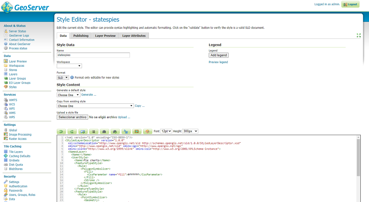
Creating a new Dynamic Style
In the SLD Editor enter the following XML:
<?xml version="1.0" encoding="ISO-8859-1"?> <StyledLayerDescriptor version="1.0.0" xsi:schemaLocation="http://www.opengis.net/sld http://schemas.opengis.net/sld/1.0.0/StyledLayerDescriptor.xsd" xmlns="http://www.opengis.net/sld" xmlns:ogc="http://www.opengis.net/ogc" xmlns:xlink="http://www.w3.org/1999/xlink" xmlns:xsi="http://www.w3.org/2001/XMLSchema-instance"> <NamedLayer> <Name></Name> <UserStyle> <Name>Pie charts</Name> <FeatureTypeStyle> <Rule> <PolygonSymbolizer> <Fill> <CssParameter name="fill">#AAAAAA</CssParameter> </Fill> <Stroke /> </PolygonSymbolizer> </Rule> </FeatureTypeStyle> <FeatureTypeStyle> <Rule> <PointSymbolizer> <Geometry> <ogc:Function name="centroid"> <ogc:PropertyName>the_geom</ogc:PropertyName> </ogc:Function> </Geometry> <Graphic> <ExternalGraphic> <OnlineResource xlink:href="http://chart?cht=p&chd=t:${100 * MALE / PERSONS},${100 * FEMALE / PERSONS}&chf=bg,s,FFFFFF00" /> <Format>application/chart</Format> </ExternalGraphic> <Size> <ogc:Add> <ogc:Literal>20</ogc:Literal> <ogc:Mul> <ogc:Div> <ogc:PropertyName>PERSONS</ogc:PropertyName> <ogc:Literal>20000000.0</ogc:Literal> </ogc:Div> <ogc:Literal>60</ogc:Literal> </ogc:Mul> </ogc:Add> </Size> </Graphic> </PointSymbolizer> </Rule> </FeatureTypeStyle> </UserStyle> </NamedLayer> </StyledLayerDescriptor>Note
The CSS equivalent of this style is the following
* {
  fill: #AAAAAA;
  stroke: #000000;
  z-index: 0;
}

* {
  mark: url('http://chart?cht=p&chd=t:${100 * MALE / PERSONS},${100 * FEMALE / PERSONS}&chf=bg,s,FFFFFF00');
  mark-mime: 'application/chart';
  mark-size: [20 + 60 * (PERSONS / 20000000.0)];
  mark-geometry: [centroid(the_geom)];
  z-index: 1;
}
Note
The z-index produces two different FeatureTypeStyle in this CSS example
In order to have the states layer use this style with no additional indications, modify the default style of the states layer using the user interface to point to the newly created statespies.
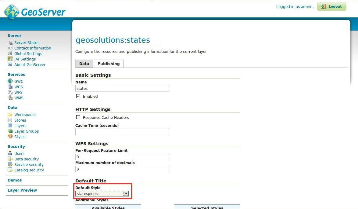
Changing the default style of the states layer
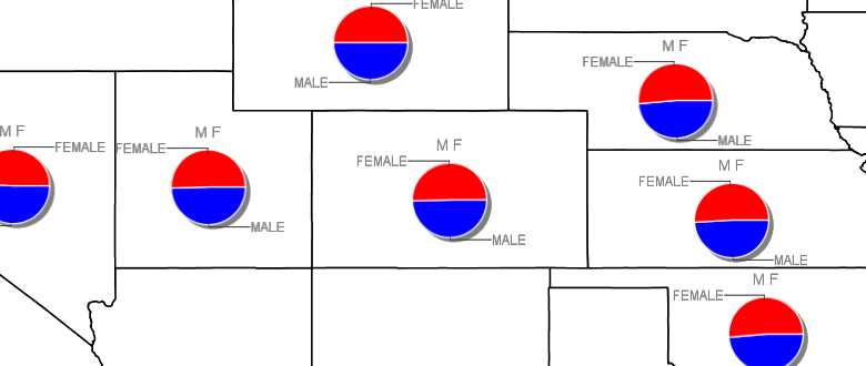
Now go to the Layer Preview to view the new style in action.
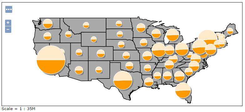
Previewing the states layer with the statespies applied
Pie Chart Options
Let us quickly analyse the components of the ExternalGraphic call, which follow the rules of a Google Charts API call:
Pie Chart Types
The cht parameter allows us to control the type of pie. Supported options are as follows:
- cht=p for a 2D (flat) Pie
- cht=p3 for a 3D (flat) Pie
- cht=pc is not supported.
Pie Chart Data
chd=t:${100 * MALE / PERSONS},${100 * FEMALE / PERSONS} the chart data is expressed in “text” format, and in particular, the first value is the result of 100 * MALE / PERSONS, where MALE and PERSONS are two attributes of feature being rendered
Pie Chart Background
chf=bg,s,FFFFFF00: we state that the chart background fill is solid, white and transparent. In particular, the color is expressed as RRGGBBAA, where AA is the alpha component, which controls transparency. 0 is fully transparent, 255 is fully opaque
Pie Chart Size
The size of the chart is controlled using the usual <Size> element of external graphics, and in particular, it’s setup so that it’s proportional to the PERSONS attribute via the expression: 20 + (PERSONS / 20,000,000) * 60.
Pie Chart Colors
We can specify the colors of all values, each value, or some values using the chco parameter. This override the usage of the default Background Fills chf parameter, hence it is optional.
Syntax is as follows:
chco=<color_slice_1>,<color_slice_2>
for specifying individual colors for slices and
chco=<color_1>|<color_2>
for specifying a gradient to be applied to the slices.
where color is in RRGGBB hexadecimal format.
Pie Chart Labels
We can specify labels for individual pie chart slices using the chl parameter.
The syntax is a follows:
chl=<label_value>| ... |<label_value>
Pie Chart Rotation
Pie Chart Rotation can be achieved via the chp parameter. By default, the first series is drawn starting at 3:00, continuing clockwise around the chart.
The syntax is as follows:
chp=<radians>
Additional information on creating pie charts can be found on the official pie charts documentation
A more comprehensive example can be found here below:
<?xml version="1.0" encoding="ISO-8859-1"?> <StyledLayerDescriptor version="1.0.0" xsi:schemaLocation="http://www.opengis.net/sld http://schemas.opengis.net/sld/1.0.0/StyledLayerDescriptor.xsd" xmlns="http://www.opengis.net/sld" xmlns:ogc="http://www.opengis.net/ogc" xmlns:xlink="http://www.w3.org/1999/xlink" xmlns:xsi="http://www.w3.org/2001/XMLSchema-instance"> <NamedLayer> <Name></Name> <UserStyle> <Name>Pie charts</Name> <FeatureTypeStyle> <Rule> <PolygonSymbolizer> <Fill> <CssParameter name="fill">#ffffff</CssParameter> </Fill> <Stroke /> </PolygonSymbolizer> </Rule> </FeatureTypeStyle> <FeatureTypeStyle> <Rule> <PointSymbolizer> <Geometry> <ogc:Function name="centroid"> <ogc:PropertyName>the_geom</ogc:PropertyName> </ogc:Function> </Geometry> <Graphic> <ExternalGraphic> <OnlineResource xlink:href="http://chart?cht=p&chf=bg,s,FFFFFF00&chd=t:${100 * MALE / PERSONS},${100 * FEMALE / PERSONS}&chl=MALE|FEMALE&chs=200x100&chco=0000ff,ff0000&chtt=M+F" /> <Format>application/chart</Format> </ExternalGraphic> </Graphic> </PointSymbolizer> </Rule> </FeatureTypeStyle> </UserStyle> </NamedLayer> </StyledLayerDescriptor>Note
The CSS equivalent of this style is the following
* {
  fill: #ffffff;
  stroke: #000000;
  z-index: 0;
}

* {
  mark: url('http://chart?cht=p&chf=bg,s,FFFFFF00&chd=t:${100 * MALE / PERSONS},${100 * FEMALE / PERSONS}&chl=MALE|FEMALE&chs=200x100&chco=0000ff,ff0000&chtt=M+F');
  mark-mime: 'application/chart';
  mark-geometry: [centroid(the_geom)];
  z-index: 1;
}
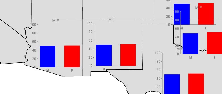
The resulting image can be found here below:
Bar Charts
Quoting Wikipedia,
“A bar chart or bar graph is a chart with rectangular bars with lengths proportional to the values that they represent. The bars can be plotted vertically or horizontally. A vertical bar chart is sometimes called a column bar chart.”
Let us now create a sample map using the Bar Charts element leveraging on the the data provided with the training. Afterwards we will review the various options.
To print dynamic charts on a map using a Bar symbol over the United Stats map add a new style called statesbars by adding the SLD provided below as indicated in this picture.
Creating a new Dynamic Style with Bar Charts
In the SLD Editor enter the following XML:
<?xml version="1.0" encoding="ISO-8859-1"?> <StyledLayerDescriptor version="1.0.0" xsi:schemaLocation="http://www.opengis.net/sld http://schemas.opengis.net/sld/1.0.0/StyledLayerDescriptor.xsd" xmlns="http://www.opengis.net/sld" xmlns:ogc="http://www.opengis.net/ogc" xmlns:xlink="http://www.w3.org/1999/xlink" xmlns:xsi="http://www.w3.org/2001/XMLSchema-instance"> <NamedLayer> <Name></Name> <UserStyle> <Name>Pie charts</Name> <FeatureTypeStyle> <Rule> <PolygonSymbolizer> <Fill> <CssParameter name="fill">#ffffff</CssParameter> </Fill> <Stroke /> </PolygonSymbolizer> </Rule> </FeatureTypeStyle> <FeatureTypeStyle> <Rule> <PointSymbolizer> <Geometry> <ogc:Function name="centroid"> <ogc:PropertyName>the_geom</ogc:PropertyName> </ogc:Function> </Geometry> <Graphic> <ExternalGraphic> <OnlineResource xlink:href="http://chart?cht=bvg&chf=bg,s,FFFFFF00&chd=t:${100 * MALE / PERSONS},${100 * FEMALE / PERSONS}" /> <Format>application/chart</Format> </ExternalGraphic> <Size> <ogc:Add> <ogc:Literal>20</ogc:Literal> <ogc:Mul> <ogc:Div> <ogc:PropertyName>PERSONS</ogc:PropertyName> <ogc:Literal>20000000.0</ogc:Literal> </ogc:Div> <ogc:Literal>60</ogc:Literal> </ogc:Mul> </ogc:Add> </Size> </Graphic> </PointSymbolizer> </Rule> </FeatureTypeStyle> </UserStyle> </NamedLayer> </StyledLayerDescriptor>Note
The CSS equivalent of this style is the following
* {
  fill: #ffffff;
  stroke: #000000;
  z-index: 0;
}

* {
  mark: url('http://chart?cht=bvg&chf=bg,s,FFFFFF00&chd=t:${100 * MALE / PERSONS},${100 * FEMALE / PERSONS}');
  mark-mime: 'application/chart';
  mark-size: [20 + 60 * (PERSONS / 20000000.0)];
  mark-geometry: [centroid(the_geom)];
  z-index: 1;
}
Bar Chart Options
Let us quickly analyse the components of the ExternalGraphic call, which follow the rules of a Google Charts API call:
Bar Chart Types
The cht parameter allows us to control the type of pie. Supported options are as follows:
- cht=bvg for simple 2D vertical Bars layed out as groups.
- cht=bhg for simple 2D horizontal Bars layed out as groups.
- cht=bvs for simple 2D vertical Bars layed out as stacks.
- cht=bvo is not supported.
Bar Chart Data
chd=t:${100 * MALE / PERSONS},${100 * FEMALE / PERSONS} the chart data is expressed in “text” format, and in particular, the first value is the result of 100 * MALE / PERSONS, where MALE and PERSONS are two attributes of feature being rendered. This type of sequence is good for grouped bar charts. Values for successive groups are separated by |. Values within the same group are separated by comma.
Bar Chart Colors
Note
Note that by default, all series are displayed in the same color; if you don’t specify different colors for different series, it will be hard to distinguish that there are multiple series in your chart.
You can specify the colors of individual bars, individual series, or multiple series using the chco parameter. If you don’t specify a different color for each series, all series will be the same color. Syntax is as follows:
chco=<series_1_color>, ..., <series_n_color>
or
chco=<series_1_bar_1>|<series_1_bar_2>|...|<series_1_bar_n>,<series_2>,...,<series_n>
where color is in RRGGBB hexadecimal format.
Bar Chart Background
chf=bg,s,FFFFFF00: we state that the chart background fill is solid, white and transparent. In particular, the color is expressed as RRGGBBAA where AA is the alpha component which controls transparency. 0 is fully transparent, 255 is fully opaque.
Bar Chart Size
The size of the chart is controlled using the usual <Size> element of external graphics, an in particular, it’s setup so that it’s proportional to the PERSONS attribute via the expression: 20 + (PERSONS / 20,000,000) * 60.
Bar Chart Labels
Bar charts support standard axis labels, but labels along the base of the bars are assigned to individual bars rather than spread out along the bar chart (to spread out labels evenly, use the chxp parameter as described below.) If you specify axis labels but don’t specify custom labels along the bar axis, the bar labels will be the index number of each bar or group of bars. You can customize axis labels using the chxl parameter.
The syntax is a follows:
chl=<label_value>| ... |<label_value>
Additional information on creating pie charts can be found on the official bar chart documentation
A more comprehensive example can be found here below:
<?xml version="1.0" encoding="ISO-8859-1"?> <StyledLayerDescriptor version="1.0.0" xsi:schemaLocation="http://www.opengis.net/sld http://schemas.opengis.net/sld/1.0.0/StyledLayerDescriptor.xsd" xmlns="http://www.opengis.net/sld" xmlns:ogc="http://www.opengis.net/ogc" xmlns:xlink="http://www.w3.org/1999/xlink" xmlns:xsi="http://www.w3.org/2001/XMLSchema-instance"> <NamedLayer> <Name></Name> <UserStyle> <Name>Pie charts</Name> <FeatureTypeStyle> <Rule> <PolygonSymbolizer> <Fill> <CssParameter name="fill">#dddddd</CssParameter> </Fill> <Stroke /> </PolygonSymbolizer> </Rule> </FeatureTypeStyle> <FeatureTypeStyle> <Rule> <PointSymbolizer> <Graphic> <ExternalGraphic> <OnlineResource xlink:href="http://chart?chxt=x,y&chxl=0:|M|F&cht=bvg&chco=0000ff,ff0000&chf=bg,s,FFFFFF00&chd=t:${100 * MALE / PERSONS}|${100 * FEMALE / PERSONS}&chs=200x200&chtt=M+F" /> <Format>application/chart</Format> </ExternalGraphic> </Graphic> </PointSymbolizer> </Rule> </FeatureTypeStyle> </UserStyle> </NamedLayer> </StyledLayerDescriptor>Note
The CSS equivalent of this style is the following
* {
  fill: #dddddd;
  stroke: #000000;
  z-index: 0;
}

* {
  mark: url('http://chart?chxt=x,y&chxl=0:|M|F&cht=bvg&chco=0000ff,ff0000&chf=bg,s,FFFFFF00&chd=t:${100 * MALE / PERSONS}|${100 * FEMALE / PERSONS}&chs=200x200&chtt=M+F');
  mark-mime: 'application/chart';
  z-index: 1;
}
The resulting image can be found here below: